

Homepage Conversion Redo
Homepage Conversion Redo
Homepage Conversion Redo
From research & analytics through to IA, visual design & design system
Intro
Client
Client
Emoov
Role
Role
Senior Designer
Industry
Industry
Proptech
Timeline
8 Weeks
Team
PM, Marketing, 1 Dev
Homepage Redesign & Conversion Strategy
Homepage Redesign & Conversion Strategy
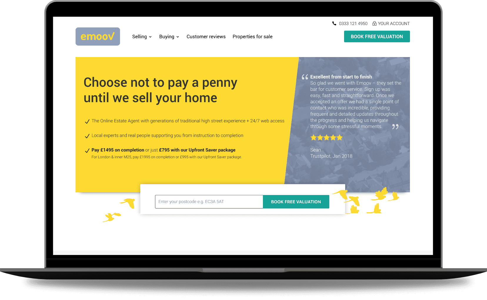
Emoov was disrupting the UK property market with fixed fees and no commission. The proposition was strong, but the homepage was a bottleneck.
Emoov was disrupting the UK property market with fixed fees and no commission. The proposition was strong, but the homepage was a bottleneck.
My Scope
I owned the redesign end-to-end. From research and analytics through to information architecture, visual design, and the design system that emerged from the work.
I owned the redesign end-to-end. From research and analytics through to information architecture, visual design, and the design system that emerged from the work.
Behavioural analysis using Hotjar heatmaps and session recordings
Question-driven IA strategy.
Design system foundation and component library
Competitive audit across UK estate agent homepages
Responsive UI design for desktop and mobile
The Challenge
Visitors were landing, hesitating, and leaving or worse, they were calling support because they couldn't find basic answers.
Visitors were landing, hesitating, and leaving or worse, they were calling support because they couldn't find basic answers.
Outcome Snapshot

+31%
Postcode entries
+38%
Scroll depth
+41%
Package page visits
-22%
Package-related calls
Research
Understanding The Failures
Understanding The Failures
Before touching a single layout, I needed to understand exactly where and why the page was failing. I combined three research methods: behavioural analytics, competitive analysis, and an internal feedback loop from the customer service team to define the failures.
Before touching a single layout, I needed to understand exactly where and why the page was failing. I combined three research methods: behavioural analytics, competitive analysis, and an internal feedback loop from the customer service team to define the failures.


Behavioural Data
Heatmaps showed 34% of users never made it past the hero.
Heatmaps showed 34% of users never made it past the hero.
Heatmaps showed 34% of users never made it past the hero.
Those who did were scanning rapidly without reading, skipping CTAs entirely and leaving with less confidence than when they arrived. The page was creating confusion, not resolving it.
Those who did were scanning rapidly without reading, skipping CTAs entirely and leaving with less confidence than when they arrived. The page was creating confusion, not resolving it.
never scrolled past the hero section
never scrolled past the hero section
34%
never scrolled past the hero section
left without visiting a second page
left without visiting a second page
76%
left without visiting a second page
of visits led to product page from homepage
of visits led to product page from homepage
8%
of visits led to product page from homepage
Competitive Analysis
Auditing leading UK estate agent homepages made the gap impossible to ignore.
Auditing leading UK estate agent homepages made the gap impossible to ignore.
Auditing leading UK estate agent homepages made the gap impossible to ignore.
The strongest performers Purple Bricks, Yopa led with lifestyle imagery, surfaced their key benefits immediately and gave users a clear process overview before asking them to commit.
The strongest performers Purple Bricks, Yopa led with lifestyle imagery, surfaced their key benefits immediately and gave users a clear process overview before asking them to commit.


Customer Service Insight
I built a tracking framework to capture caller pain points in real time.
I built a tracking framework to capture caller pain points in real time.
I built a tracking framework to capture caller pain points in real time.
Working with CS leaders, I implemented a Salesforce module that triggered at the end of every call asking agents to log the reason for the call, the caller's stage of decision and their primary concern. The data surfaced the dominant query types quickly, giving me a clear picture of exactly what the homepage needed to answer and wasn't.
Working with CS leaders, I implemented a Salesforce module that triggered at the end of every call asking agents to log the reason for the call, the caller's stage of decision and their primary concern. The data surfaced the dominant query types quickly, giving me a clear picture of exactly what the homepage needed to answer and wasn't.
had visited the homepage pre picking up the phone
had visited the homepage pre picking up the phone
72%
had visited the homepage pre picking up the phone
of calls were about package pricing or process
of calls were about package pricing or process
64%
of calls were about package pricing or process
of support calls traced directly back to the homepage
of support calls traced directly back to the homepage
40%
of support calls traced directly back to the homepage
Strategy
From The Research Came Questions
From The Research Came Questions
Selling a home is a high-anxiety transaction. People don't make that decision randomly; they follow a logical path of questions that the homepage needs to answer quickly. I re-architected the IA based on customer feedback into a five-part narrative designed to resolve doubt in the order it naturally occurs:
Selling a home is a high-anxiety transaction. People don't make that decision randomly; they follow a logical path of questions that the homepage needs to answer quickly. I re-architected the IA based on customer feedback into a five-part narrative designed to resolve doubt in the order it naturally occurs:
Content Hierarchy Hypothesis

"What even is this?" Eye-tracking data placed the core value proposition exactly where first-time visitors look first — immediate clarity before anything else.
My Question Hypothesis
What Is Emoov?
What Are The Benefits?
Can I Trust Emoov?
What's The Process?
Why Choose Emoov?
Content Hierarchy Hypothesis
What is this? Clarity first. Used eye-tracking data to place core value props in the primary attention zones.
What Is Emoov?
What Are The Benefits?
Can I Trust Emoov?
What's The Process?
Why Choose Emoov?
The Wireframes
The Wireframe Journey
The Wireframe Journey
With the hierarchy hypothesis defined, I moved into high fidelity wireframes. I built on a component-based layout system. Designing with reusable components from the start meant I could rapidly swap, reorder and test hierarchy variations without rebuilding from scratch — keeping validation fast and decisions evidence-led.
With the hierarchy hypothesis defined, I moved into high fidelity wireframes. I built on a component-based layout system. Designing with reusable components from the start meant I could rapidly swap, reorder and test hierarchy variations without rebuilding from scratch — keeping validation fast and decisions evidence-led.

The Feedback
Testing my question hypothesis
Testing my question hypothesis
Testing my question hypothesis
To validate the hypothesis I built three distinct hierarchy variations and tested them with users, tasking each to find key information and observing how naturally they moved through the page.
To validate the hypothesis I built three distinct hierarchy variations and tested them with users, tasking each to find key information and observing how naturally they moved through the page.
task completion rate in Hierarchy 1
task completion rate in Hierarchy 1
87%
task completion rate in Hierarchy 1
reached package information without prompting in Hierarchy 2
reached package information without prompting in Hierarchy 2
73%
reached package information without prompting in Hierarchy 2
described the page flow as logical in Hierarchy 1
described the page flow as logical in Hierarchy 1
73%
described the page flow as logical in Hierarchy 1
needed to backtrack in Hierarchy 2
needed to backtrack in Hierarchy 2
67%
needed to backtrack in Hierarchy 2
My Hypothesis Won
The Foundations Are Done
The Foundations Are Done
The Foundations Are Done
The winning hierarchy 3 wasn't just faster, users flowed through the decision journey logically, navigating off into specific sections for detail while resolving the main call drivers through the homepage scan alone.
The winning hierarchy 3 wasn't just faster, users flowed through the decision journey logically, navigating off into specific sections for detail while resolving the main call drivers through the homepage scan alone.
task completion rate in Hierarchy 3 first time.
task completion rate in Hierarchy 3 first time.
87%
task completion rate in Hierarchy 3 first time.
reached package information without prompting in Hierarchy 3
reached package information without prompting in Hierarchy 3
73%
reached package information without prompting in Hierarchy 3
needed to backtrack in Hierarchy 3
needed to backtrack in Hierarchy 3
0%
needed to backtrack in Hierarchy 3
of users described the page flow as logical in Hierarchy 3
of users described the page flow as logical in Hierarchy 3
91%
of users described the page flow as logical in Hierarchy 3

The Design
Designing a Visual Language From the Ground Up
Designing a Visual Language From the Ground Up
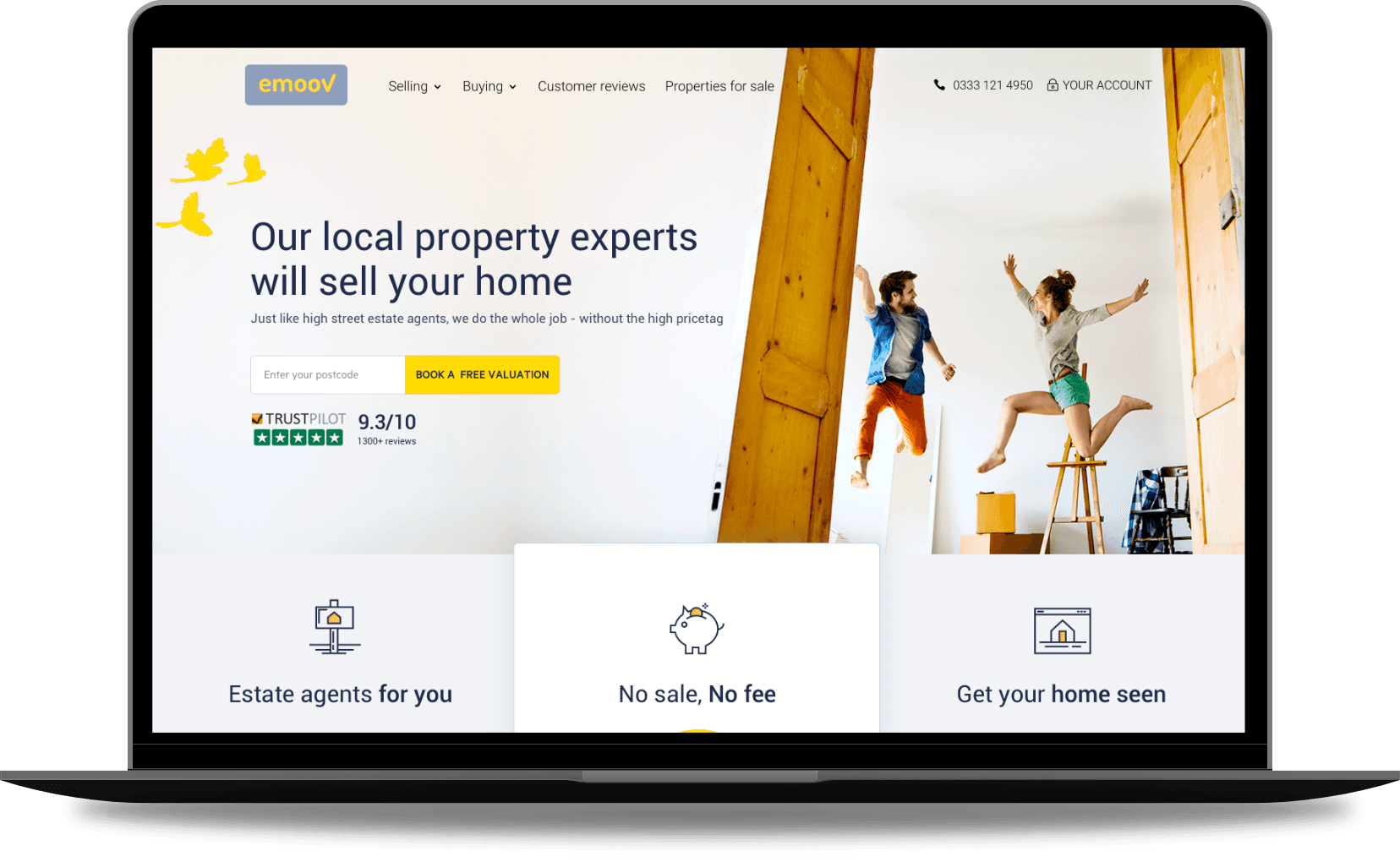
With the component structure validated, the design phase focused on building a cohesive visual system, not just a page. Every section was designed as a reusable component, with a consistent layout logic that could scale beyond the homepage and form the foundation of a wider design system.
With the component structure validated, the design phase focused on building a cohesive visual system, not just a page. Every section was designed as a reusable component, with a consistent layout logic that could scale beyond the homepage and form the foundation of a wider design system.
Lofi Wireframe
Hifi Wireframe
Hifi UI Design
Lofi Wireframe

Hifi Wireframe

Hifi UI Design

Focusing Design On The User
Reducing Load, Increasing Clarity
Reducing Load, Increasing Clarity
Reducing Load, Increasing Clarity
Distinct layout sections used brand colour purposefully, calm light blues balancing the energy of the primary yellow to create visual breathing room and a clear brand connection.
Each section carried a single CTA or contextual link, keeping users focused and moving forward. Lifestyle imagery brought warmth and context that the previous page had never had. A new icon suite was designed from scratch, clean lines with consistent yellow accents, built to work across the page and serve as the foundation for the wider icon library going forward.
Before vs After
Design System
A Single Source Of Truth
A Single Source Of Truth
The homepage redesign surfaced something the business didn't yet have: a single source of truth for design. Rather than treating component decisions as one-off choices, I built them into a centralised library that could scale across every future page.
The homepage redesign surfaced something the business didn't yet have: a single source of truth for design. Rather than treating component decisions as one-off choices, I built them into a centralised library that could scale across every future page.
The Design Building Blocks
Collaborating To Build The Design System
Collaborating To Build The Design System
Collaborating To Build The Design System
Working with the head of brand, I established brand-specific usage rules alongside the component build to create a foundation for design components at Emoov. These included:
Working with the head of brand, I established brand-specific usage rules alongside the component build to create a foundation for design components at Emoov. These included:
Responsive components adaptable across every future page
Full colour system with hex values and usage rules
24 custom icons with consistent line weights and yellow accents
CTA and interaction specs agreed with developers
Typography scale from H1 to caption fully defined

Component System
Icons
Colour Palette


Future Proofing
The Evolution
The Evolution
No centralised design foundation had existed at Emoov before this project. The homepage became the starting point for everything that followed.
A living kit any team member could build from and evolve without breaking consistency. Faster builds, fewer isolated decisions, one place where design and brand stayed permanently aligned but constantly evolved.
The Impact
The A/B Test Validation
The A/B Test Validation
The redesign was released as an A/B test against the original page and after three weeks of testing outperformed projections across every metric. Support call volume dropped, hero CTA engagement increased significantly and users were successfully navigating to product pages, something the original page had almost entirely failed to achieve.
The redesign was released as an A/B test against the original page and after three weeks of testing outperformed projections across every metric. Support call volume dropped, hero CTA engagement increased significantly and users were successfully navigating to product pages, something the original page had almost entirely failed to achieve.
Variant B outperformed Variant A across every tracked metric from week one
Variant B outperformed Variant A on every metric
Postcode Entries
The single CTA focus and hero clarity delivered the biggest lift exactly where the page had its most broken starting point.
+31%
Postcode Entries
Scroll Depth
The fold tease and question hierarchy directly solved the 34% hero drop-off. Every other metric flows from this one.
+38%
Scroll Depth
Package Page Visits
Package confusion was the dominant CS issue. A dedicated section with direct CTAs fixed it at the point of need.
+41%
Package Page Visits
CTA Click-Through
Removing visual noise and committing to one CTA per viewport lifted click-through across the board.
-22%
CTA Click-Through
Reduction in Package CS Calls
The clearest validation that the IA decisions worked beyond the screen. The homepage was answering questions that had previously required a phone call.
-22%
Reduction in Package CS Calls
Tasks Completed
The sharpest single indicator of how comprehensively the redesign outperformed the original in user testing.
-22%
Tasks Completed


Reflections
The success of this project wasn't just in the UI
The success of this project wasn't just in the UI
The success of this project wasn't just in the UI
The biggest lesson from Emoov wasn't a design principle — it was a positioning one.
By identifying that the homepage was responsible for 22% of inbound support calls, I could present the redesign as an operational cost-saver, not a visual refresh. That framing changed the conversation with stakeholders entirely. Every decision had a documented customer pain point behind it, which meant sign-off was fast and trust was high throughout.
Architecturally, the IA work mattered more than anything visual. Getting the order of information right — answering the questions users actually had, in the sequence they naturally asked them — was what drove the metric lifts. The polish followed the structure, not the other way around.
Menu